Developing further on our HTML knowledge from weeks back we then went into using CSS which stands for Cascading Style Sheets. This controls how a HTML page look and shouldn’t provide content on a page.
We went on to use CSS to style a page rather than editing the HTML.
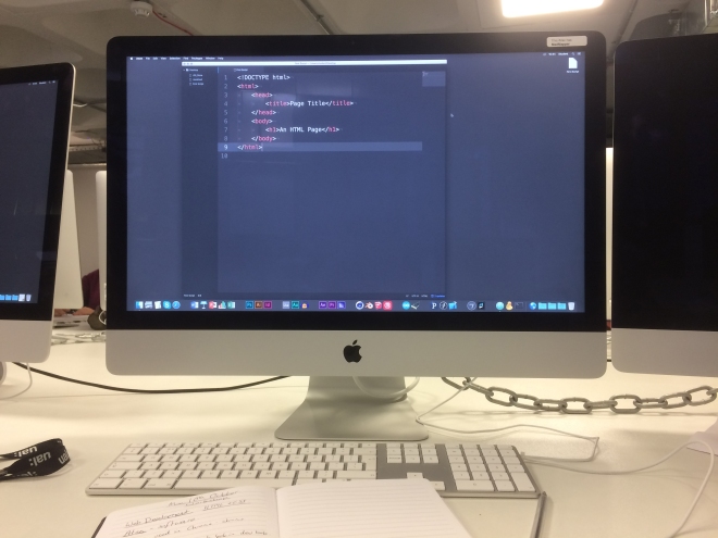
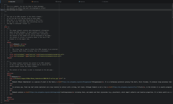
The HTML of the Page.
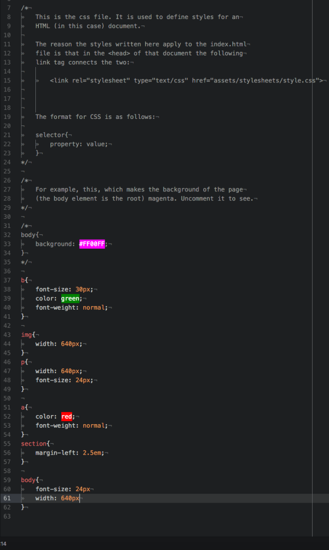
The style-sheet of the page I had formatted.
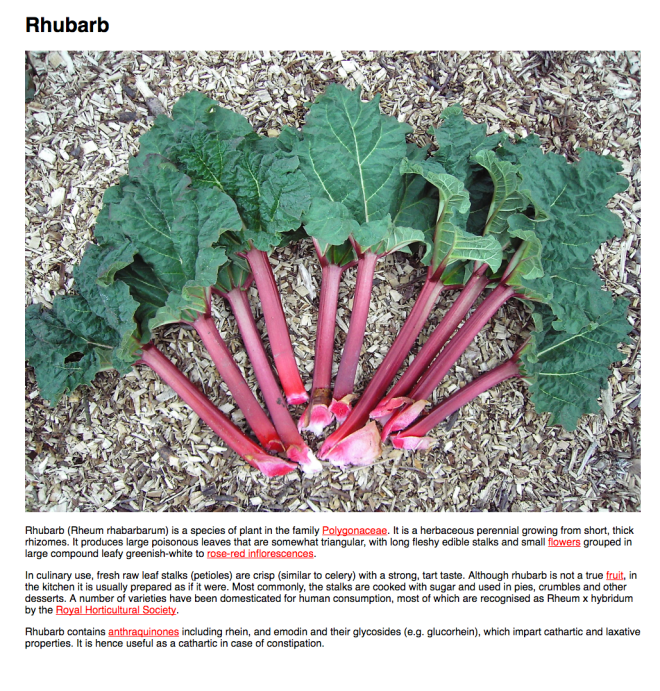
The end result.
This task I found beneficial in further enhancing my understanding of using html, and how CSS is used to edit the look of the page.
In our groups we each went around to each group displaying our Projection Mapping, and talking about our ideas and how we came to create them. We went around each group giving our opinions and feedback on their work, giving constructive criticism and suggesting any things that could be done to enhance their work. For example one of the critics I made for one of the groups, was that their bubbles didn’t indicate what their stats were for, as for their group project was on ethnicity in Elephant and Castle.
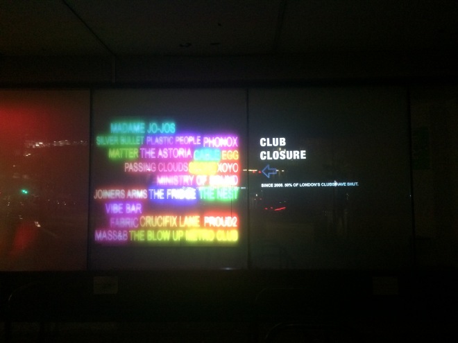
When it came to our group, we presented our projection on Club Closure. Some points were raised about our work, for example we attempted to make a calendar effect on our second screen. However, our peers suggested that the calendar wasn’t necessarily needed as it would draw focus from the key information from the neon text which was our main focus as it showed the passing of all the clubs fading out. From this we decided to later on replace the calendar with some text to help give further context about the project and what the neon effect is about. Another point, that was quite critical in explaining what exactly our project was for was that it just needed a title – for this we decided to put it on the other panel.
Preparations for the Projections
After receiving feedback we then went on to amending our projection based on our feedback in time for it to be displayed.
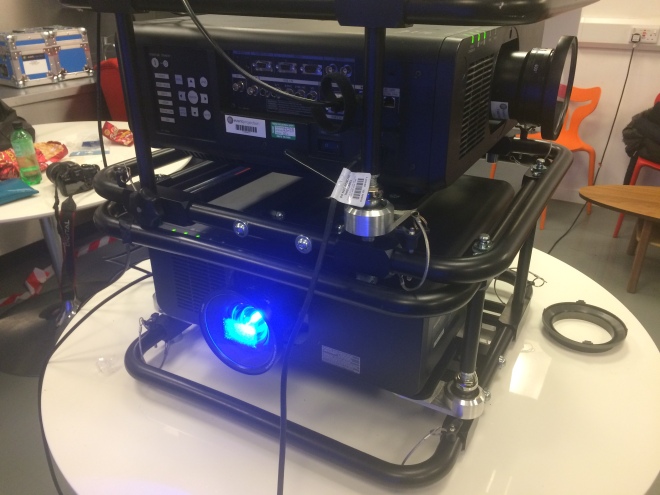
Image of some of the Projectors we used.
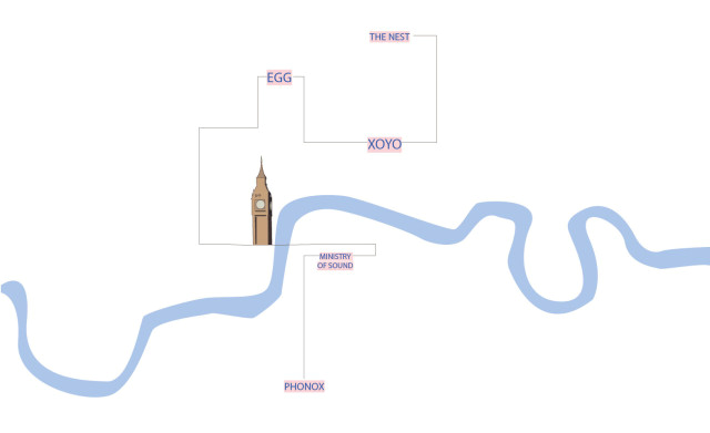
We then regrouped as a class at the Typo Café were we where going to project our visualisations, and measured the panes. From this we worked that each window needed 9.5 sheets of A1 paper for the panes to be completely covered.
The Set Up.
After covering all the panes, and helping each other set up our Projections we then went onto ours to set up.
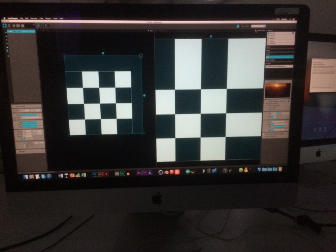
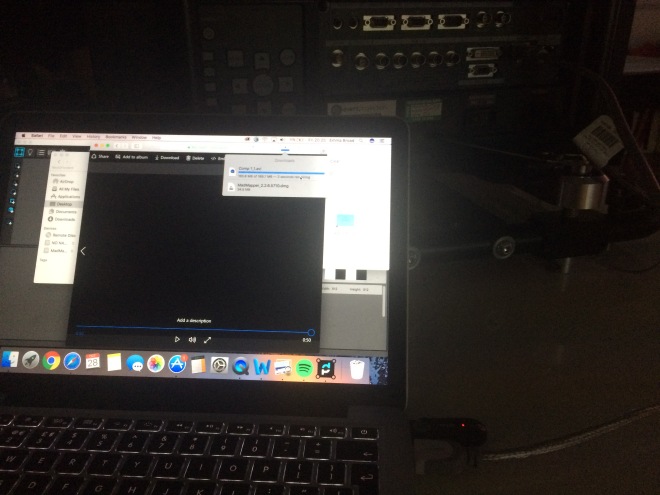
Setting up our Projection using Mad Mapper.
After successfully setting it up on both panes despite the measurements not being accurate to the window panes – we then went out to look at our projection from the outside.
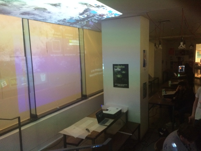
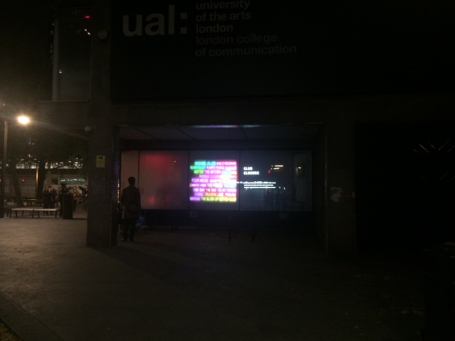
Close-up of our projection from the outside.
Street View of our Projection – with pedestrian looking at it.
Once we looked at ours we then went around looking at the classes Projections to see how they turned out. I left like I had learned a lot from this project looking into further detail on how to develop and outcome as well as the task of group work and learning how to use Mad Mapper that I feel like I could use again for future projects.
Today we had a workshop with John looking at the history behind typography.
What is typography? – the study of type.
We looked through some of the techniques used in a letter press, which were the term leading came from which is the space between words. Then from the letter press onto linotype which is today with line of type, we found out before the use of the linotype the maximum number of pages a newspaper had was 8 as it took time to set up each page. Moving on from linotype we looked at photo type setting which used light to project a image with this it mean that pages could be scaled.
We then looked through the difference of Bitmap Font – pixels which had a fixed number of sizes, and vector font which is defined mathematically so can be scaled to any size.
One of the reason for changing screen resolution you would change it depending on using a different device.
We discussed that Photoshop is resolution depend were as Illustrator is resolution independent. Looking at True type font & Postscript Font. Examples of ragged right / Justified left.
Example of text justification.
Looking at CSS = cascading style sheets.
Kerning = altering the space between selected pairs of letters.
After looking at a summary of the history of Typography we then were given the task to go out and trace various signs and posters tracing over text of interest looking it fonts and how they are presented. After tracing and collecting a variety of text we then identified that the majority of text use Helvetica. After going around presenting each others findings we then were set into groups to design various things using text, for my group we were tasks to design a protest sign.
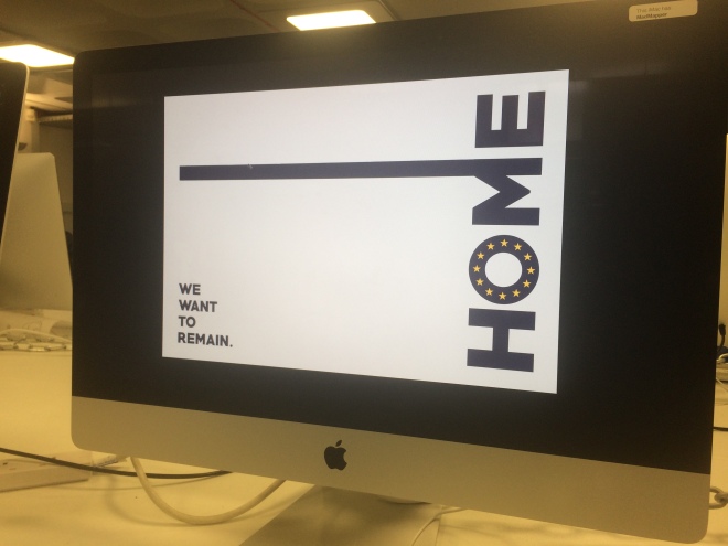
The Protest Sign we developed in 30 minutes.
After quickly choosing our subject on Brexit we produced a protest. We got some feedback on it saying that the main text ‘we want to remain’ should be much larger, as well as to fix the leading on the text. I found this workshop very informative, and helped expand my knowledge of type as it would become a everyday use later on when working on briefs.
On the Monday we did some more group work focusing on our project aided by Oliver over the weekend we decided to drop the idea of the map design and focus on just using the neon text to display our idea.
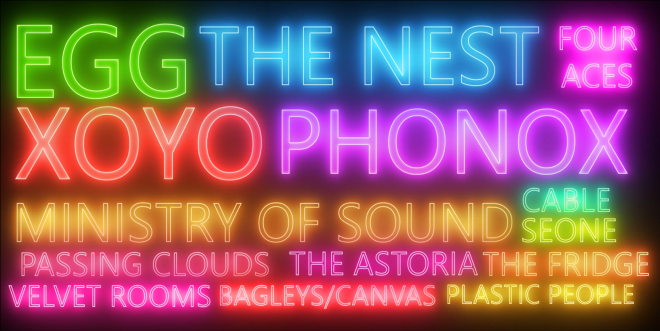
A screenshot of our testing for our design piece using the neon text
After talking our idea to Oliver and showing our current progress it was pointed out that we needed something to add to our piece to help give some context about our projection. We decided to add a second screen after on Friday working out the measurements of the windows we would be projecting on. The second panel would have a few short statements talking about the piece to help give a idea and a countdown to show the passing of time to show how many clubs disappeared over our time frame.
As we decided to have two screens I decided to change the layout of the designs and added further clubs that my group members researched I decided to right align it as it would be on two screens it would look like they are linked. Furthermore to reduce the size of the larger clubs as originally I left them big as they were the clubs that were remaining still, and instead have them be the last that remain before going back on a loop.
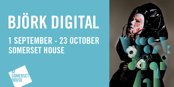
On Friday we went to see the Björk Digital Exhibition.
The Exhibition expanded across 4 rooms, each using a VR equipment to show a 360 video. 3 of them you could sit down for on a 360 rotating chair whilst the 4th you could stand up for. At the end there was a room where you could relax and just watch more of Bjork’s videos in various styles.
This gave insight in further possibilities I could explore using project as well as using Virtual Reality as a possible medium to explore. How I could incorporate using Virtual Reality and 3D software as a possible way of showing information.
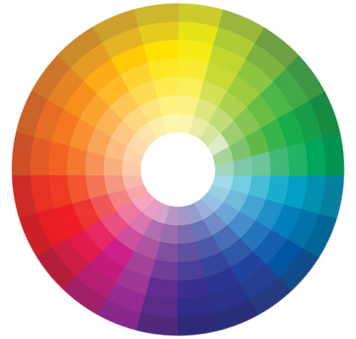
In todays workshop we had a colour theory lesson taught by Biggles.
Colour wheel, showing the various colours such as primary, secondary and tertiary colours.
We discussed a range of colour theory such as primary colours (red, yellow, blue), complimentary colours and Tertiary colours which are in-between secondary colours.
We went through a wide variety of tests such as if you stared at a colour on top of a white background then moved it away or changed the colour you would see the opposite of complimentary colour of that colour. Another example is if you took a green colour and made it very dark, and added a full chrome of red on top the red would look much brighter. Finally, another example we did this time with greys if you added a colour in the middle of a grey it would appear that the tone of grey would look colder or warmer depending on the tone of colour, albeit being the same tone a grey.
One of the main points I got from this workshop was that Colour overrides form, and a further insight into colour theory.
On Monday we had further introduction into Mad Mapper and Project Mapping as a whole given by Oliver. He showed us further how to use Mad Mapper using projectors and how to use projects as well as the settings that comes with that you have to adjust and change. One of the advice he gave up during the introduction is that preferable you want the background to be a similar colour to the background which you’re displayed so its not obvious that its a projection for example in a dark room you want the background to be black. Where as on a white surface you want it to be white, if the tone is still different you can change the brightness and contrast to get it exactly how you want it.
Photo of us using MadMapper
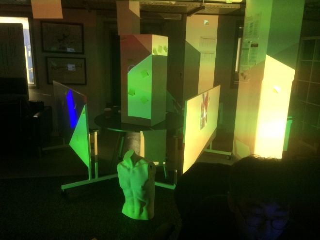
We then went into groups and were given a projector each among the groups we then had to set up the projector and use Mad Mapper and display a video. After completing the first taste we then were given the taste to project a image or a video onto small post it notes, one of the videos we did we masked it across two post it notes. Once we were familiar with the software we then as a class we placed our 4 projections around a series of columns and sides from different angles to cover the different areas. We first started by each group using a solid cover to identify which area was being covered by each group, our group in particular had green and one side of a panel/board. After everyone set up their projections and configured it correctly we then each played different videos across the different sides creating this rather cool and interesting effects with various videos overlapping or combined with each other.
Photo of the class projecting light over various object using multiple projects in preparation to cast various effects over the surfaces.
In our workshop class Tobias went through how to use Adobe InDesign and the different tools associated with it.
He explained how different colour formats were when printing files. Examples of these are CYMYK & RBG, CYMYK is used mainly in printing to describe the colours that is used in standard printers, whilst RGB, is red, green and blue which is used for viewing on screen.
He talked about different graphic types such as a bitmap and a vectors. A bitmap is a image that is treated as individual pixels. In comparison to a vector graphic is a series of co-ordinates that is connected by lines and shapes using a mathematical formula, which means it can be endlessly scaled and will not blur in comparison to a pixel based image.
After the induction into InDesign we then went back into our project groups working further on the design work looking at this neon effect I created and how we could layout our design work for our interactive piece.
One of the design tests my group member Emma did based on our sketches
After a while we then went through again presenting each of our work to Tobias and Tobias giving feedback on our group. After Tobias went back and gave feedback on our project and what we were doing when then decided to alter our original design to instead focus on club closure times which was one of the idea Tobias suggested as a possible route. We then as a group set ourselves the task of collecting data specifically on club closure times as well as why they closed and when the clubs was first opened.
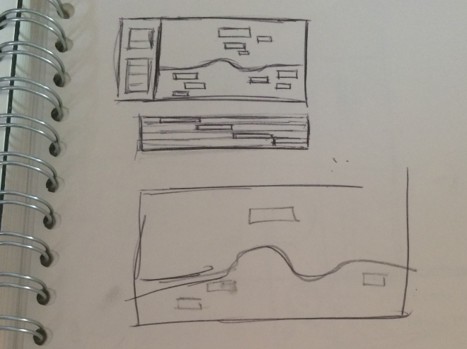
One of the sketches I did exploring the design using the UFO infographic as inspiration.
In this workshop taught by Biggles we looked into ‘Perspective: Forgotten Language’. He talked about how if we were taught perspective at School that it was actually wrong. We went through the history of perspective looking at viewpoints, and how artists such as Albrecht Durer painted his paintings with the idea to be looked at from a certain viewpoint in order to see them without distortion. Exploring the works of Leonardo Da Vinci and others as we as viewers looking at them at the correct viewpoint it would make us feel like they are real and that we are in those spaces.
We then went on into pairs and drew on glass drawing at different viewpoints looking further into this idea of distortion, and that that is in fact “true perspective”. After the initial task of drawing from different viewpoints we then did various drawing techniques using pen looking at forms and shapes and drawing just using the eye not looking at the page. We did various different techniques like, drawing with just lines, drawing with a few details and drawing particular features such as a silhouette.
This is very useful as it gave insight into how I could possible project for the mapping project. Furthermore, It aided in thinking how I could possibly display and what “view points” I could use to display our content.
In todays workshop we looked into HTML (Hyper Text Markup Language). One of the points that was made was that it is not for layout or styling rather it provides structure for web design and through this makes it accessible for a large rage of audiences and platforms no matter how outdated the software.
We were taken through the basics of HTML exploring various tag types and web addresses that we could use when we explore it further in later projects. Atom was the text editing tool we used to program in and we used chrome as we could use their developer tools page to see into the code of a website, so that we could look into how particular websites were made and how they presented their pages.
Towards the end of the workshop we then looked into projection mapping looking at various examples such as works by Joanie Lemercie and the design company Kimchi and Chips. Furthermore briefing looking at the software that we would use to do this called Mad Mapper showing what we could do on it when we display for out assignment.
Learning how to use HTML in Atom.
CTS
In the afternoon we had a CTS lesson exploring “What we do when we talk about critical thinking.” with our lecturer Rachael Finney. One of the points we made from this is that we use critical thinking skills in everyday life all the time – automatically, and that CTS aims to help articulate that critically. One of the main points that came out from the lesson was “to think critically is to question.” with this in mind we where paired into groups and given a image to think “critically” about. In the task our pair was given this obscure image of what we initially thought was a exhibition of some kind, midway through the task our groups were given some context about out images to help suggest gain a further understanding of the image or to give us a direction to think about. Through the task the main steps we where to ask about when thinking critically was to look into the Description, Analysis and Evaluation and a point she gave us was before looking at a reading “the date itself can give us already a lot of information and understanding the context and history”. In my opinion one of the points I personally came out of the CTS is that you cannot analyse without a brief understanding of the context something is it and through that you can think critically.
 Colour wheel, showing the various colours such as primary, secondary and tertiary colours.